Customer-Segmentation-Project
A project I created implementing customer segmentation using an artificial dataset from Kaggle.
Author: Brian Docena
Introduction
The motivation for this project was during class when I learned K-Means Clustering. I thought the concept of creating clusters based on points’ feature values was simple, but interesting and I thought about how it would be used in a real life scenario. This situation led me to want to implement clustering based on customer data. It would be hard to come across a dataset for this application because of privacy concerns, so I just searched for data on Kaggle that had interesting features. Sadly, this dataset was artificially generated so the insights and analysis were not as interesting as I wanted it to be. ecommerce_customer_data_large is the data from Kaggle that was artificially generated, which contains 250,000 rows and the following columns:
| Column | Description |
|---|---|
| ‘Customer ID’ | ID Number of the Customer |
| ‘Purchase Date’ | The Date and Time of the Purchase |
| ‘Product Category’ | The Type of Category the Product Belongs to |
| ‘Product Price’ | The Price of the Product |
| ‘Quantity’ | Amount the User Bought of the Product |
| ‘Customer Age’ | The Age of The Customer |
| ‘Returns’ | Values were assigned 1 or 0 where 0 represented No Return and 1 represented Return |
| ‘Customer Name’ | Name of the Customer |
| ‘Age’ | Age of the Customer |
| ‘Gender’ | Gender of the Customer |
| ‘Churn’ | Values were assigned 0 if they were retained or 1 if they were churned |
Data Cleaning and Exploration
Since this dataset was artificially generated, there wasn’t much needed to do for data cleaning. However, I did transform the data with the following steps:
- I used probabilistic imputation on the return column to fill missing values.
- I saw that the only column that had null values were the returns column. To handle this I wrote code to see how the values were distributed. I saw that the returns were randomly distributed between no return and returned. I thought the best decision was to fill in the return column using imputation, keeping the randomness intact.
- I renamed the columns so that instead of spaces there were underscores.
- This was just a personal preference. I am used to words being separated by underscores instead of spaces.
- I dropped Customer_Name and Age columns.
- I thought the Customer_Name was not valuable and I would have done this for privacy concerns. The Age column was repeated, so I dropped it.
The final dataframe has 250,000 rows and 13 columns. (Note: the following visualization is a portion of the columns)
| Customer_ID | Purchase_Date | Product_Category | Product_Price | Quantity | Total_Purchase_Amount | Payment_Method | Customer_Age | Returns | Customer_Name | Age | Gender | Churn |
|---|---|---|---|---|---|---|---|---|---|---|---|---|
| 44605 | 2023-05-03 21:30:02 | Home | 177 | 1 | 2427 | PayPal | 31 | 1 | John Rivera | 31 | Female | 0 |
| 44605 | 2021-05-16 13:57:44 | Electronics | 174 | 3 | 2448 | PayPal | 31 | 1 | John Rivera | 31 | Female | 0 |
| 44605 | 2020-07-13 06:16:57 | Books | 413 | 1 | 2345 | Credit Card | 31 | 1 | John Rivera | 31 | Female | 0 |
| 44605 | 2023-01-17 13:14:36 | Electronics | 396 | 3 | 937 | Cash | 31 | 0 | John Rivera | 31 | Female | 0 |
| 44605 | 2021-05-01 11:29:27 | Books | 259 | 4 | 2598 | PayPal | 31 | 1 | John Rivera | 31 | Female | 0 |
Exploratory Data Analysis
For analysis, I was disappointed with the results. Since the data was artificially generated, the analysis was not as insightful as it could have been.
The first thing I did was to see the statistics on the numeric columns of this dataset:
| count | mean | std | min | 25% | 50% | 75% | max | |
|---|---|---|---|---|---|---|---|---|
| Product_Price | 250000 | 254.743 | 141.738 | 10 | 132 | 255 | 377 | 500 |
| Quantity | 250000 | 3.00494 | 1.41474 | 1 | 2 | 3 | 4 | 5 |
| Total_Purchase_Amount | 250000 | 2725.39 | 1442.58 | 100 | 1476 | 2725 | 3975 | 5350 |
| Age | 250000 | 43.7983 | 15.3649 | 18 | 30 | 44 | 57 | 70 |
Here we can see that the average transaction is around $255 and customers usually buy 3 items.
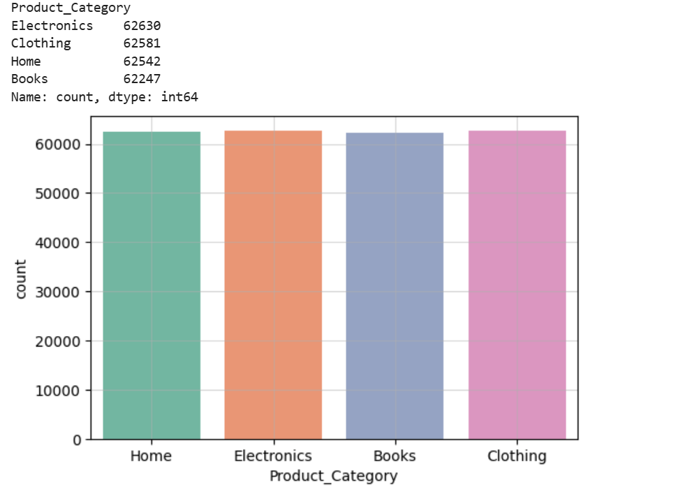
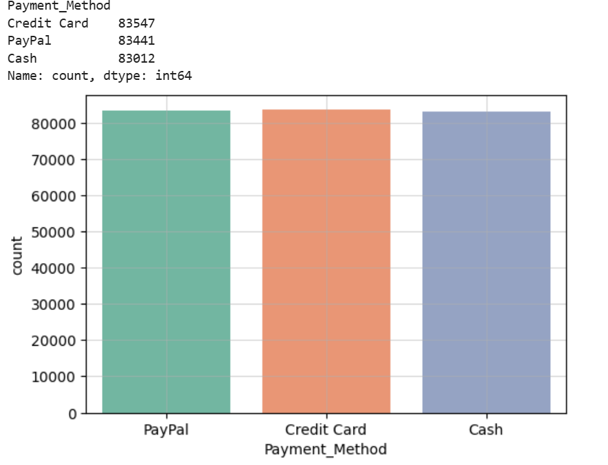
Next, I wanted to see the amount that customers bought from each category and the payment method used. Sadly, because of the nature of the dataset, the values within the columns were evenly distributed.
Here is the amount bought for each category:
Here is the amount of customers that use each payment method:
Continuing with my analysis, I thought that it would be useful to use the purchase date of customers to see the season each customer bought their item. This provides us with insight on what seasons are popular amongst customers.
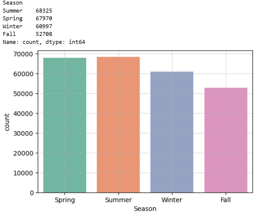 We can see based on this visualization that the warmer seasons (Spring and Summer) are more popular
Finally, I wanted to see how age correleated with how much a customer purchased in a single transaction.
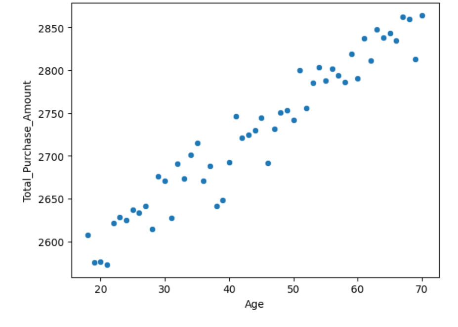
Here we can see that there is a positive correlation between age and amount purchased in a single transaction.
RFM Analysis
Since I was doing a customer segmentation project, I thought it was fitting to also do a RFM analysis on my dataset. RFM stands for recency, frequency, and monetray value. These values represent how recent customers bought their product, how often they buy, and how much they spend. This is useful in identifying valuable customers.
For this analysis I calculated recency based on today’s date and a customer’s most recent transaction date. I then used count to see how many transactions customers had and summed the total amount of their transactions.
This has led me to the result dataframe:
| Recency | Frequency | Monetary | Recency_Score | Frequency_Score | Monetary_Score | RFM_Group | RFM_Score_Total |
|---|---|---|---|---|---|---|---|
| 397 | 3 | 6290 | 2 | 1 | 1 | 2-1-1 | 4 |
| 181 | 6 | 16481 | 4 | 4 | 4 | 4-4-4 | 12 |
| 331 | 4 | 9423 | 3 | 2 | 2 | 3-2-2 | 7 |
| 550 | 5 | 7826 | 1 | 3 | 2 | 1-3-2 | 6 |
| 533 | 5 | 9769 | 2 | 3 | 2 | 2-3-2 | 7 |
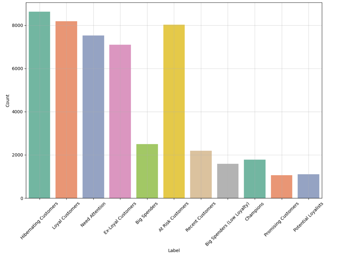
I then used regular expressions and a function to map labels accordingly onto customers’ RFM Score.
Here is the final result:
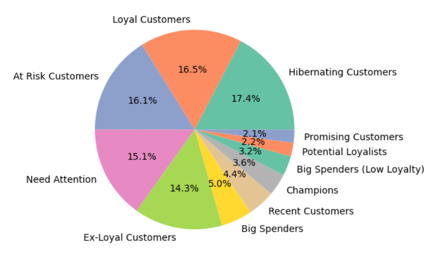
Here is the result as a pie chart:
Feature Engineering
For more useful and insightful clusters, I did more feature engineering.
Category Features
These are features based on the category of the products customers bought.
I created a column called Category_Diversity which consists of the unique amount of different categories customers bought. This value represents how much each customer branches out to different categories. I created another column called Favorite_Category, which consists of the category that the customer buys products from the most.
Return Features
These are features based on the returns of customers.
I created Total_Return, which is the total amount of returns a customer has returned. I also created Return_Rate, which is the rate of return of customers.
Behavioral Features
These are features that pertain to a customer’s buying habits.
Using the purchase date, I found the favorite hour of each customer by finding the hour that the customer made the most purchases in. Similarly, using the same technique, I found the customer’s favorite day of the week.
Spending Trends
Using the purchase date, I found each customer’s favorite season by finding the month the customer made the most transactions in.
This is an example row of the final result of my dataframe after feature engineering:
| Customer_ID | Purchase_Date | Total_Transactions | Total_Purchase_Amount | Total_Products | Average_Transaction | Average_Quantity_Per_Transaction | Age | Gender | Category_Diversity | Favorite_Category | Total_Return | Return_Rate | Favorite_Hour | Favorite_Day | Favorite_Season |
|---|---|---|---|---|---|---|---|---|---|---|---|---|---|---|---|
| 1 | 397 | 3 | 6290 | 15 | 2096.67 | 5 | 67 | Female | 3 | Books | 1 | 0.0666667 | 6 | 1 | Spring |
Identifying Outliers
Since I was using K-Means Clustering for my customer segmentation project, it was important to identify and get rid of outliers within my dataset. This is because we are taking the mean distance from each centroid to determine each cluster and since mean is not robust to outliers, this will affect the results and quality of our clusters.
In order to identify outliers I used an Isolation Forest as this algorithm has an easier time isolating outliers due to outliers having distinct characteristics that the algorithm recognizes.
Here is what my dataframe looked like after identifying the outliers:
| Customer_ID | Purchase_Date | Total_Transactions | Total_Purchase_Amount | Total_Products | Average_Transaction | Average_Quantity_Per_Transaction | Age | Gender | Category_Diversity | Favorite_Category | Total_Return | Return_Rate | Favorite_Hour | Favorite_Day | Favorite_Season | Outlier_Scores | Is_Outlier |
|---|---|---|---|---|---|---|---|---|---|---|---|---|---|---|---|---|---|
| 1 | 397 | 3 | 6290 | 15 | 2096.67 | 5 | 67 | Female | 3 | Books | 1 | 0.0666667 | 6 | 1 | Spring | 1 | 0 |
| 2 | 181 | 6 | 16481 | 18 | 2746.83 | 3 | 42 | Female | 4 | Electronics | 4 | 0.222222 | 2 | 0 | Summer | 1 | 0 |
| 3 | 331 | 4 | 9423 | 15 | 2355.75 | 3.75 | 31 | Male | 3 | Electronics | 1 | 0.0666667 | 0 | 6 | Winter | 1 | 0 |
| 4 | 550 | 5 | 7826 | 19 | 1565.2 | 3.8 | 37 | Male | 4 | Books | 3 | 0.157895 | 1 | 2 | Fall | 1 | 0 |
| 5 | 533 | 5 | 9769 | 13 | 1953.8 | 2.6 | 24 | Female | 2 | Home | 5 | 0.384615 | 4 | 2 | Spring | 1 | 0 |
After running the algorithm this is the percentage of inliers / outliers within my data:
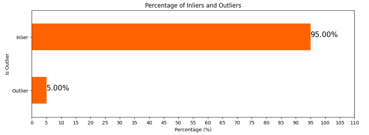
After identifying the outliers, I dropped them from my dataframe.
Determining Multicollinearity
To determine multicollinearity I created a heat map:
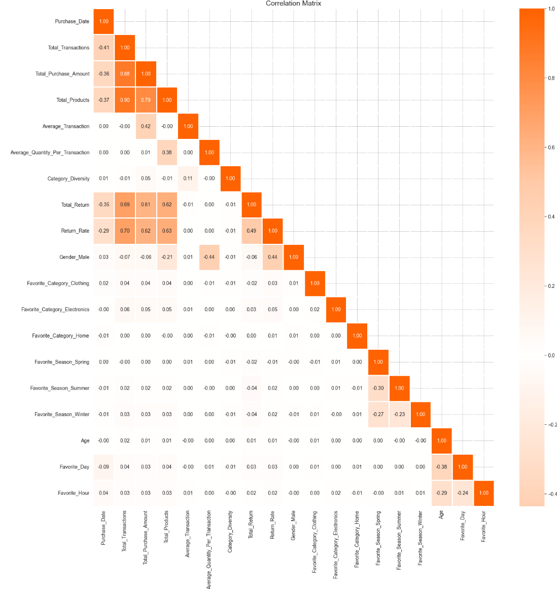
From the heat map it is important to note some features that are highly correlated with each other:
- Total_Transactions and Total_Purchase_Amount
- Total_Transactions and Total_Products
- Total_Purchase_Amount and Total_Products
Multicollinearity is important for our clusters because if there is multicollinearity within our data, this could affect the quality of our clusters as features do not provide unique information.
Finding Optimal Components for PCA
Since we identified multicollinearity within our data we can use PCA it helps reduce the effect of multicollinearity by tranforming the data into uncorrelated data.
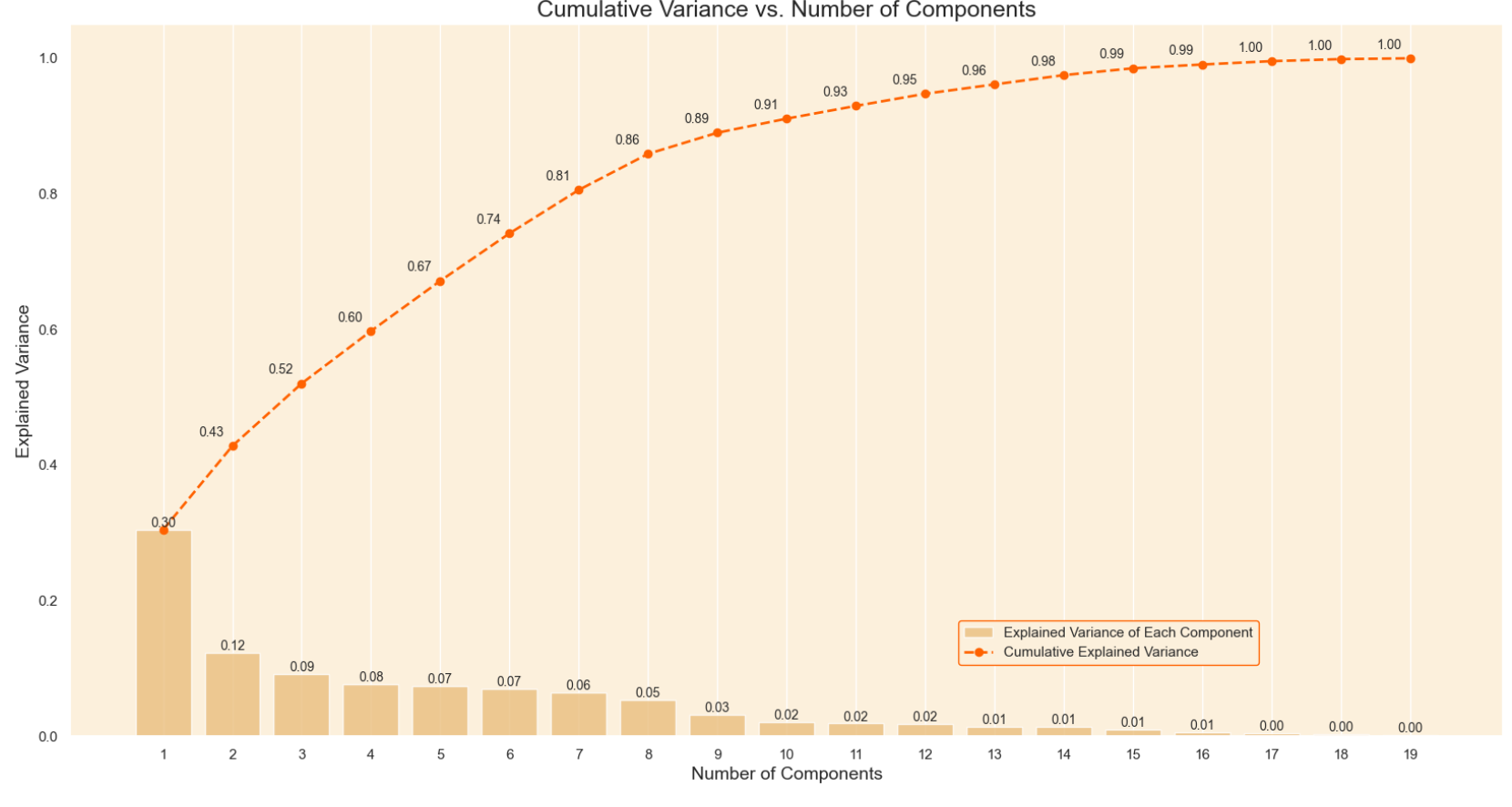
Here we can see the graph of the explained variance which shows how much of the variance is obtained by each principal component. I chose 7 as the number of components as this is the point where the cumulative variance slows down.
Utilizing PCA
After running PCA with 7 components this is the result:
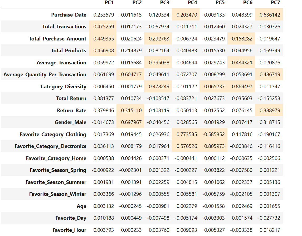
The highlighted cells are the coefficients that correspond to each principal component.
Determining Optimal Number of Components
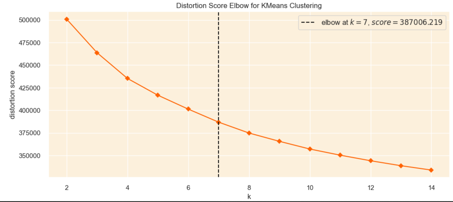
Elbow Method
The Elbow Method is a technique used to find the optimal number of clusters by generating clusters for different values of k and calculating the sum of squared difference of each point and the closest centroid. If we plot the sum of squared differences we can identify the point where adding more clusters does not significantly reduce the sum of squared difference, creating an “elbow”. However, the downside of this method is that the “elbow” is usually vague and hard to identify.
Utilizing the Silhouette Method
The silhouette method is another technique used to find the optimal number of clusters in a dataset. This method calculates a silhouette score for each data point that measure how well each point is assigned to a cluster.
To use the silhouette method you have to choose a range of clusters, then use the resulting cluster as a parameter for the silhouette score.
I plotted the silhouette score and the silhouette cofficients to find the most optimal clusters.
Here is the final result:
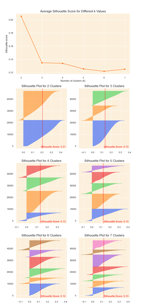
Interpreting the Silhouette Visualization
To determine the most optimal amount of clusters I looked at the number of clusters with the highest mean silhouette score and looking at the silhouette plots that are roughly the same thickness and width.
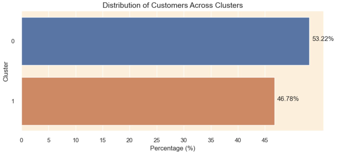
Creating the Clusters
After performing clustering, here is the result of the distribution of the customers amongst the clusters.
Evaluating Cluster Quality
To evaluate my clusters I’m going to use the Silhouette Score (higher values indicate better clustering), Calinski Harabasz Score (high score indicates better clustering), and Davies Bouldin Score (lower value indicates better clustering).
Here is the evaluation of my clusters:
+————————-+———————+ | Metric | Value | +————————-+———————+ | Number of Observations | 46862 | | Silhouette Score | 0.20510671991363183 | | Calinski Harabasz Score | 15007.420975858586 | | Davies Bouldin Score | 1.6801126746929693 | +————————-+———————+
From my evaluation we can see that my silhouette score is 0.20, which is not ideal, meaning that there could be some overlap between the clusters. My Calinski Harabasz score is super high, which indicates that my clusters are well-defined. My Davies Bouldin Score of 1.68 is reasonable indicating that my clusters are somewhat similar.
Clusters
Here are my resulting clusters:
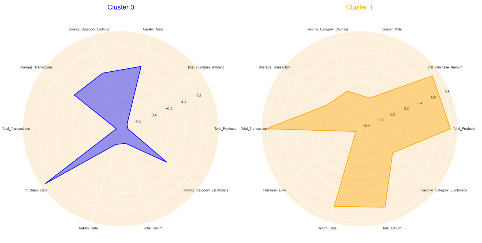
Cluster Interpretation
Cluster 0: Customers in cluster 0 are usually males whose favorite shopping category are usually electronics or clothing. They have a moderate average transaction, which means that for each transaction they spend an average amount. These customers do not shop frequently shown in the high purchase_date.
Cluster 1:The customers in cluster 1 are usually females. These customers have purchased the most amount of items shown in the high total transaction, total purchase amount, and total products. These customers have made purchases recently as shown in the low purchase_date. These customers also have a high return rate and total return.